Solar Choice recently published updated info that allowed me to fix the Australian data from the previous graph I posted. As expected the cost per watt went up by around 800 dollars a kilowatt. That said, Australian systems are still going for nearly half the cost of solar in the U.S. Tragic...
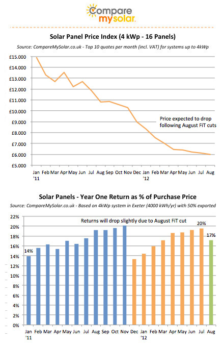
I've also added a graph which shows the trajectory of system costs in the U.K. Note that in the U.K. you have to pay the VAT on a PV system (at least that's my understanding) but in Germany the VAT is refunded. Italy as I recall has a reduced VAT on PV systems. So many VAT rules, so little time.

*German data comes from BSW. US data comes from GTM & SEIA. Australian data comes from IEA & Solar Choice. Italian data comes from IEA and personal research. U.K. data comes from Compare my solar. I've thrown in some guesstimates here and there to smooth out spaces with sparse data. Data with sources can be found in the Economics of Photoelectricity spreadsheet.
**The current Australia data has the STC striped out but the pre-2012 data still has the STC included in the system price. This is why the Australian data takes a strange dive and then suddenly plateaus. If I had the STC removed from the pre-2012 data the graph would probably be much more gradual. Here's a similar graph that shows the dive in system prices.
No comments:
Post a Comment